Cascade layers, subgrid, and container queries: What's new in CSS
As CSS inches closer to its 30th birthday, it continues to evolve and improve more rapidly than ever. Let’s take a cursory look at some of its newest features being shipped in the near future: cascade layers, subgrids, and container queries.
Cascade layers in CSS
First, here’s a quick background on what exactly we mean by “cascade.”
Styles can come from a few different sources, such as the browser’s defaults or the stylesheets we author as web developers. Some of these sources take precedence over others. Traditionally, we think of the cascade as follows:
- User-agent stylesheet (browser defaults)
- User settings
- Author stylesheets
Styles in the website author’s stylesheets take precedence over the browser defaults. (This is not to be confused with selector specificity, which is resolved within each layer of the cascade.)
What the new cascade layers feature allows us to do as CSS authors is add and control additional layers of the cascade. So, rather than all of a website’s styles being lumped into a single cascade layer, authors can now create multiple cascade layers and control their order of precedence:
- User-agent stylesheet (browser defaults)
- User settings
- Author layer “C”
- Author layer “B”
- Author layer “A”
- Etc.
Before we dive into the syntax of defining cascade layers, let’s look at some use cases and problems you might solve with additional control over the cascade.
Why use cascade layers in CSS?
Cascade layers allow us to circumvent some of the thorniest parts of working in CSS code. In some cases, we will be able to avoid the use of !important because basic, overridable styles can simply be placed in a lower-precedence cascade layer.
For example, you might consider placing typical “reset” styles in their own cascade layer, and styles from a third-party CSS library in another. You could also put utility classes — such as those used by “atomic CSS” approaches like Tailwind CSS — into their own cascade layer to take precedence over common styles without the need for !important.
Another use case could be dividing up an existing design system into different layers to allow for easy theming and customization. It will be interesting to see how modern JavaScript frameworks, which typically ship with workarounds like CSS modules or style encapsulation via emulated shadow DOM, adopt cascade layers to improve their developer and user experiences — although these features might be affected more directly by the @scope proposal, which is different but related.
Syntax
We define cascade layers and the styles that belong in them with the @layer statement. Although not required, you can declare multiple layers upfront (without any styles) to determine their order of precedence, like so:
@layer reset, base, utilities;This will create three layers called reset, base, and utilities. Styles defined in utilities will take precedence over base styles, which will take precedence over styles in reset.
To add styles to a layer, we define them in a block, like this:
@layer utilities {
  p {
    color: blue;
  }
}

@layer base {
  p {
    color: red;
  }
}
Note that because we declared the layers previously and also defined their order (the initial line: @layer reset, base, utilities;), any paragraphs on our page will be blue, even though the styles for the base layer are defined later. Had we omitted that line, the base layer would take precedence because it does appear later in our stylesheet, and the paragraphs would therefore be red.
It’s also possible to create anonymous layers:
@layer {
  p {
    color: green;
  }
}
Or load external stylesheets into a particular layer:
@import url('utilities.css') layer(utilities);We can also nest layers within other layers:
@layer outer {
  @layer innerOne {
    /* ... */
  }
}

/* Dot syntax works, too. */
@layer outer.innerTwo {
  /* ... */
}
There are several options and plenty of flexibility!
When can I use cascade layers in CSS?
Pretty soon! At the time of writing, cascade layers have already shipped to most evergreen browsers, with broader support on the way. See resources like caniuse.com for updated browser support information.
One last !important note
With the addition of multiple cascade layers, a deeper understanding of how !important works is much more, well, important. For a clear and well-written explanation (including visuals) on the nuances of how !important fits into the cascade and its effect on cascade layers, be sure to check out this article.
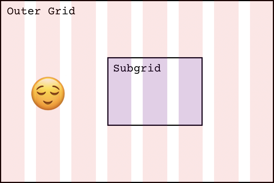
Introducing CSS’s subgrid
This new feature is much simpler — at least conceptually — than cascade layers, but is certainly still exciting and much anticipated by CSS authors. Currently, grid row and column configurations only extend to the immediate children of a grid container.
Those children can also be grid containers themselves, but to achieve a consistent alignment with the parent grid, they need to carefully configure their columns or rows to match precisely those of the parent. Sometimes that’s difficult or impossible, depending on the grid settings.
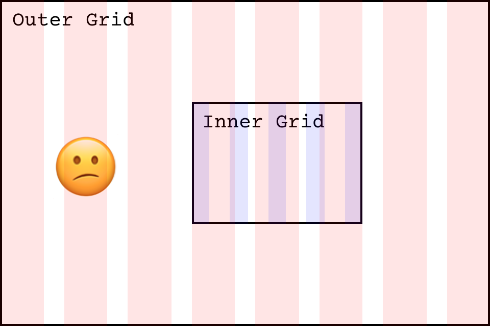
With the addition of the subgrid value for grid-template-rows and grid-template-columns, grid children can now inherit the grid row and column settings from the parent and properly position their children seamlessly and effortlessly, without the need to define or keep in sync with their own row and column settings. Nice!
For a more detailed explanation of subgrid, see “Subgrid” on the MDN docs.
When can I use subgrid?
At the time of writing, only Firefox implements the new subgrid value, but the other evergreen browsers won’t be far behind.
Mastering container queries in CSS
When browsers shipped support for media queries, the web took a giant step forward in the realm of responsive design. Media queries solved a myriad of problems, but they also exposed a new problem with complicated responsive layouts: context-aware responsiveness.
For example, you might have a component that exists within the main part of your web page and needs to change its layout based on the width of that main section. However, the width of the main section is itself dependent on the width of the browser viewport and is controlled by its own responsive layout settings.
With today’s media queries, the only way to change the layout of your inner component is to do so based on changes to the browser viewport’s width, which means you need to keep its media queries carefully in sync with those of the main section so that your component always looks correct at every viewport size. And, if you ever change your main layout, you’ll need to update your component, too.
Container queries solve this problem by allowing CSS authors to respond to the dimensions of arbitrary elements, not solely those of the viewport. This will decouple components styles from their parent containers, making responsive components vastly easier to maintain — and reduce visual layout bugs!
When can I use container queries?
Unfortunately, the specification is still under active development, and no browsers have yet implemented container queries, as the final syntax is still being refined. However, it’s one of the most widely requested features, so we should see regular progress and big updates on container queries in the near future.
Conclusion
CSS is rapidly evolving to provide better primitives for us web developers and our users. Keep an eye on these top features for your next project!