CSS-only Text Gradients
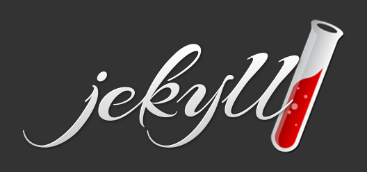
The things you can do with CSS these days are amazing. I was inspired by the beautiful Jekyll logo and set out to see if I could do something similar using only CSS.
This is the look I was going for:
I was excited to find on my first Google attempt a succinct post by the awesome Chris Coyier and I had achieved the desired effect in minutes. I thought it would be nice for a new project I’m working on called Scribbli.
Here is the complete Sass code:
$yellow: hsl(52, 80%, 53%)
h1
color: $yellow// Fallback
background: -webkit-linear-gradient(lighten($yellow, 20%), $yellow)
-webkit-background-clip: text
-webkit-text-fill-color: transparent
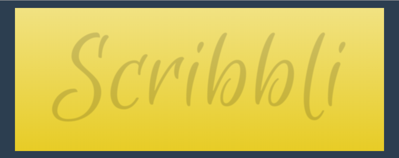
text-shadow: 0 1px 1px hsla(0, 0%, 0%, 0.15)And this is the end result for Webkit browsers (Chrome, Safari, Opera):
Breakdown
I thought we could take a closer look at what is going on here. First, let’s take a look at the fallback for non-Webkit browsers:
$yellow: hsl(52, 80%, 53%)
h1
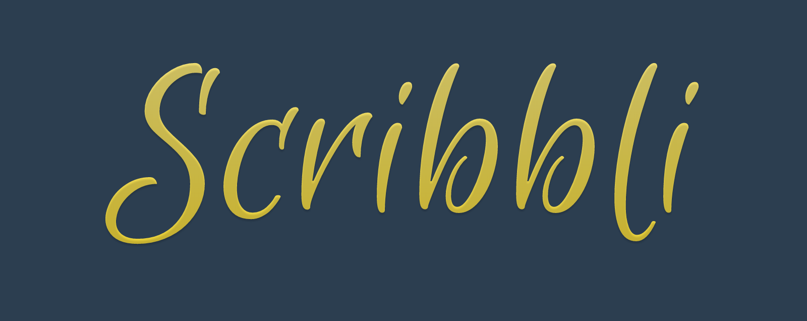
color: $yellow// FallbackThis gives us a simple text color with no effect. Not as cool as the detail we get with the gradient and the shadow, but good enough for a fallback.
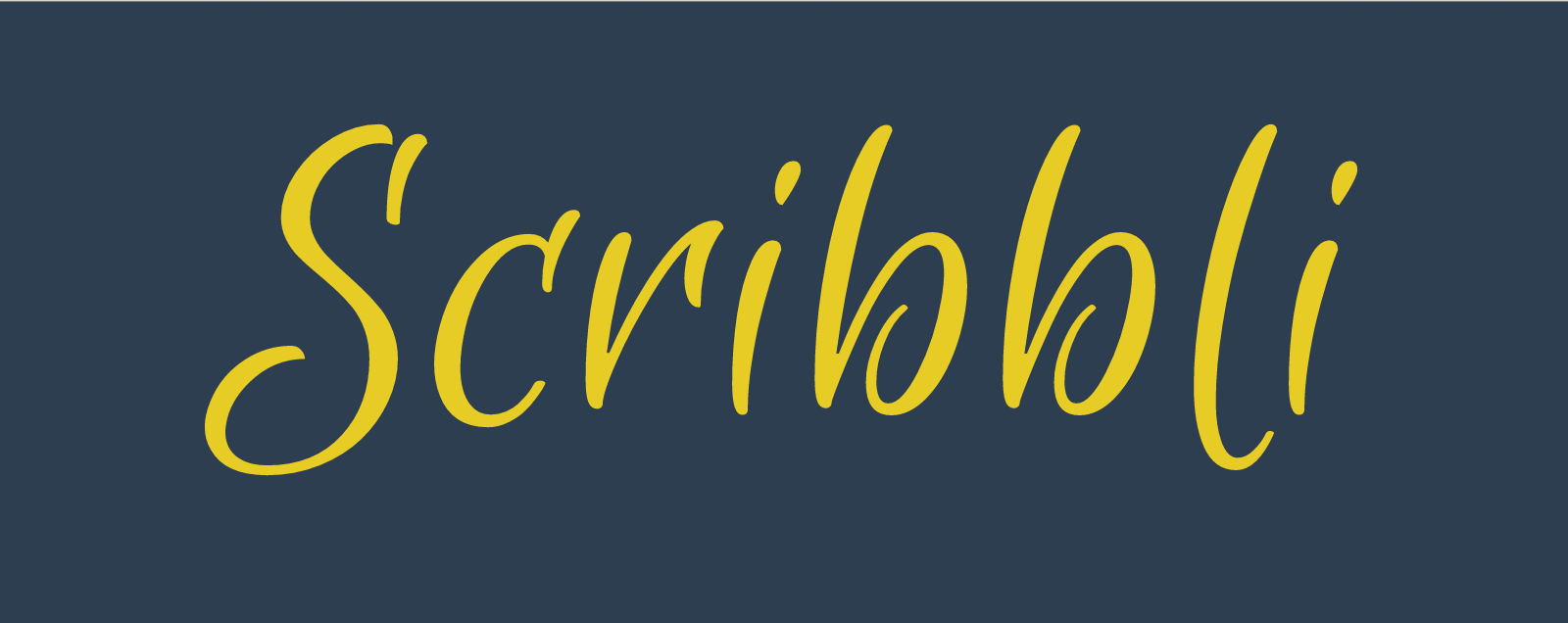
The trick is in this next part. We set a background gradient on the entire h1 element, but we restrict the visibility of the gradient to the form of the text! We also need to make the text transparent so that the gradient isn’t hidden by the flat yellow fallback we set earlier.
$yellow: hsl(52, 80%, 53%)
h1
  color: $yellow// Fallback
  background: -webkit-linear-gradient(lighten($yellow, 20%), $yellow)
  -webkit-background-clip: text
  -webkit-text-fill-color: transparent
Note that we can use some nifty Sass functions to calculate the color stops for the gradient with minimal effort. Also note that for the background gradient, we are only using the -webkit- prefix and omitting the prefixes for the other browsers. This is because the text-fill-color is only currently supported in Webkit and we don’t want the background gradient there if the rest of it doesn’t work.
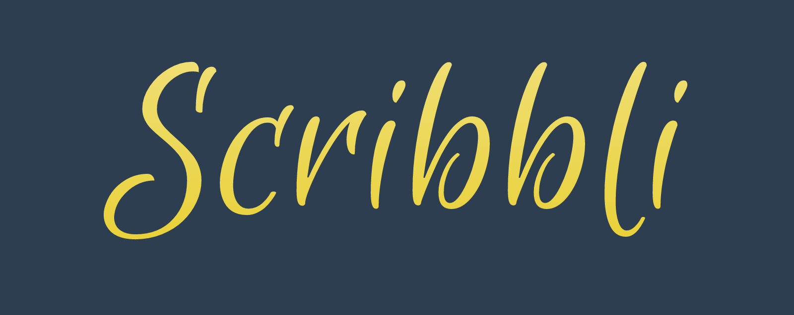
Cool. We’re almost there. Last thing to do is to add a little shadow to give the text some depth. Adding a text shadow to transparent text is different than the usual text shadow effect, because you can see the entire shadow under the text. For example: this is what the shadow looks like if we remove the background clipping mask:
Anyway, putting it all together again:
$yellow: hsl(52, 80%, 53%)
h1
  color: $yellow// Fallback
  background: -webkit-linear-gradient(lighten($yellow, 20%), $yellow)
  -webkit-background-clip: text
  -webkit-text-fill-color: transparent
  text-shadow: 0 1px 1px hsla(0, 0%, 0%, 0.15)
Even though the shadow drastically affects the apparent colors of the text since it is fully visible, it actually gives a nice embossed effect with the slight vertical offset. Once again, here is a screenshot of the final result; fully selectable, SEO-friendly text!
Additional Resources
Here is related and more in-depth article from Chris Coyier.