Practical Use Cases For The :empty Pseudo-class
At first, the :empty pseudo-class may not seem to be the most useful of the advanced selectors. However, there are situations in which :empty is the perfect tool for the job. Here are a couple of examples:
Tag/label manager UI
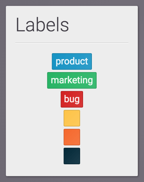
Say you were developing an application that allowed users to manage tags or labels (think Trello). It would be nice to allow users to add titles to their labels, but the labels should also be visually sufficient if no titles are added, like so:

You’ll notice that the tags without text are wider than they would be if they were simply an empty <span> with padding and a background color. The essentials of the code to achieve this is:
.label:empty {
  width: 1rem;
}
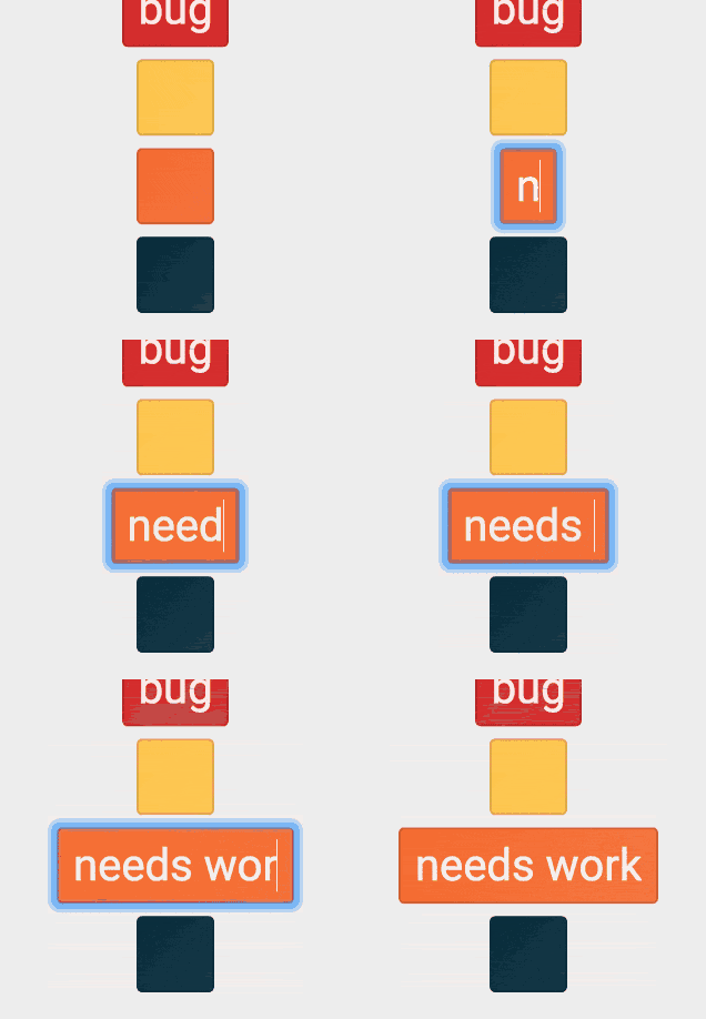
Simple, yet adds a bit of robustness to the design. I made the labels contenteditable and put it up on CodePen so that it can be played with:
Analytics dashboard UI
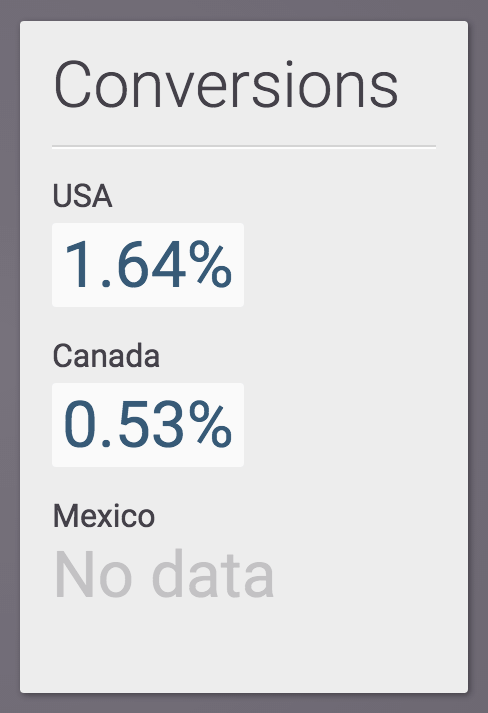
Another example use case would be a data collection user interface that hasn’t received any data yet. Suppose an application was tracking the conversion rate of an e-commerce site by geographical region, like so:

In the previous example, the elements for the USA and Canada metrics have text (“1.64%” and “0.53%”, respectively), while that of Mexico is empty. This is the relevant code:
.conversion-rate:empty::before {
  content: "No data";
  opacity: 0.25;
}
Here is a link to the live example. It’s a nice little trick that provides a better experience than simply leaving the space blank in the absence of data.
Conclusion
As web professionals, we take pride in making sure our designs look great no matter the circumstances—think responsive design, for example—and the :empty pseudo-class is another tool in our tool box to achieve that.
What other great use cases for :empty have you come up with?
